Thirty-five years ago, my first article was published in a professional journal. It was the outgrowth of a talk I gave at a business conference on the use of computer generated graphical information reporting. In 1987 those technologies were in their infancy. Computerized business graphics, pie, line, and bar charts, generated using desktop systems and output to paper, overheads, or slides were a big deal then. More sophisticated Gantt, Pert, and process flow charts sometimes required the power of mini computers and dedicated graphic terminals to produce reasonably professional looking results, for their time.
Today’s tools are dramatically more powerful, as are the portable systems on which they run. Beyond power, the diversity of data manipulation tools, visual display options, formats, presentation options of color, perspective, and style all capable of publication and distribution through multiple electronic means create limitless opportunity to create and present compelling representations of structured and unstructured data to managers and executives eager for reports on performance, profit, customer preferences, brand value, opportunity, and risk. And that brings us to a significant problem facing contemporary business leadership in the 21st century.
A triad of questions defines the problem:
“Do you know what you need to know to effectively run your business?”
coupled with
“As a result of knowing _____, what action would you take?”
The third question is one rarely asked by senior leadership, in my experience…
“If you had answers to the first two questions, would your management team know what to do with the information?”
A Data Feast Amidst Information Hunger
We have plenty of facts and details about all sorts of macro and micro measures. The proliferation and transformation of business processes into digital methods has given rise to volumes of raw data businesses in the late 20th century could only dream of capturing, storing, and exploring. Risk data was far more subjective, unstructured and lacked the precision available today. The same was generally true for many other data categories covering operating, financial, customer, partner, regulatory and compliance data. Facts alone are often incomplete communicators. And while associations possible through data manipulation tools may be novel and “interesting”, they may not be actionable. For example, relating new customer location data with lunar phase data might create something interesting. But, “As a result of knowing this what action would you take?” We cannot manage the phase of the moon. Also, data presented in charts and graphs doesn’t always tell you something useful. Let’s look at a very simple instance and see how a small alteration can lead data down the road toward useful information.
Here’s a simple bar chart in figure 1: By itself it really doesn’t provide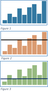 much more than a representation of a distribution of values. Perhaps that’s useful, but the measure of actionable information is nearly zero. Now, let’s add a “goal line” to Figures 2 and 3, where values above the line represent clear success and those below opportunities and challenges that should be explored and addressed. Your results, areas for attention and likely next steps vary greatly even between figure 2 and 3. These are very simplistic examples. Today’s graphical arrays are visually more sophisticated, and analytically often more complicated. The point is, the tool alone is not where the “intelligence” is expressed in Business Intelligence software. The intelligence comes from the interpretation and useful combination of data, which requires prerequisite understanding of what the data is, where it came from, how it was created, and when. While these examples are oversimplified, figures 2 & 3 begin to offer some useful and actionable information by pointing out performance against a standard of expectation, leading to follow-up on what is working well, and what is not, and what performance drivers may be adjusted to help marginal performance cases improve. Those answers may lead to changes in a variety of operating, policy, or process directions to correct performance concerns.
This is an example about one very simple metric, using a very simple graphical representation. Today’s business intelligence (BI) tools can do much more with much more complicated data. If you tracked every possible metric you could measure, and presented results this way, you’d overwhelm even the most knowledgeable stakeholder or leader. Knowing and applying context and conditional relationships helps narrow focus, support drill down detail where beneficial, and bring the real power of business intelligence tools to bear.
What Do You Need To Know?
The oft cited, but very wrong answer is “everything”! It’s just not functional. And you’d be buried in data points that told you nothing useful. Do you drive a car? Examine your dashboard. Where is the indicator for each cylinders’ compression ratio? Where is your brake pad temperature monitor? What?! You don’t know the precise volume of fuel remaining in milliliters and ounces? How are you possibly functioning? But you are. You have all the key performance and status indicators needed to operate and direct your car safely to your intended destination. You have transportation. If there was a problem, and your mechanic were to seek out some of these answers as part of a diagnostic exercise, that more concise and focused context brings in the need for different, and more specific detail. You need to know when something is and isn’t working as intended and designed. When you learn of a problem, you need to inform your specialists with the information needed to diagnose the root cause, proscribe solutions, and test remediated functions. Go back to the questions at the start of this article, to test the utility of the metrics you wish to gather. See how many pass successfully through no.’s 2 & 3. Start with that subset.
You also need to know the key driving chains that influence the metrics you do monitor. This is a kind of technical perspective upon context. For each of your key performance indicators (KPI’s) and key risk indicators (KRI’s) you need to map out what business processes influence those measures, where the source data is gathered that is used to calculate each indicator, how often, where it’s stored, and how it’s validated. This is vital context, that can provide actionable direction should an indicator’s value suddenly shift from expected norms.
So, Where Does BI Fit?
Business Intelligence software is a tool. And, like any other tool, its value is in the thoughtful, careful application by its handler. BI software is really good at helping you explore data relationships. It works best when applied in conjunction with your own knowledge of how your business works. Often the relationships between data values and different metrics may be obvious, and some may offer new insights to how seemingly unrelated processes impact one another. Use these features to explore these unique key driving chains. They may reveal important metrics to incorporate onto your standard “dashboard” of key operating metrics.
There’s an implicit benefit here that may not be obvious. Data silos, created by and supporting of dedicated systems for a specific discipline or purpose may be present across your enterprise. One of the key features of a BI tool is its ability to aggregate, interpret, and represent data from a consolidated variety of sources. This is significant. Without this capability the potential to identify useful key driving chains, letting you identify and represent the most insightful KRI’s and KPI’s would be seriously hampered. Embedding BI functionality within a platform that can collect and store data from a variety of disciplines or functions, such as an Enterprise Resource Planning (ERP) or an enterprise Integrated Risk Management (IRM) solution can deliver significant value through its ability to provide a single, authoritative resource for decision data. Value is created in part through streamlined processes, enhanced efficiency, and simplified system management. Additionally, the ability to manage access, protect confidential data, provide vetted information, and efficiently publish business information through a consistent, reliable portal cannot be overestimated.
BI tools can offer insight into how clients and customers engage your business, help inventory managers fine tune reorder horizons to minimize overstocks and stock-outs, and inform you of sales trends, client preferences, and campaign reactions far sooner than training periodical reporting. Having data and BI tools proximate helps polish efficiency in getting actionable information into managers and leaderships’ hands sooner, so that your business runs with clear vision of the road before you.
Visual Tools, Actionable Information
Visual representation of data is a valuable characteristic of BI tools. We are a visual society. While there are some of us who relate best to columns and arrays of numbers or symbols, for the most part people relate to visual representations of data. Pictures over words. It’s a very powerful method for effectively communicating fact, concept, and relationships. Pictures often traverse the boundaries and nuances of words and speech. Pictograms and charts form an almost universal language of their own. Whether you are working with simple heat maps representing significant risk areas, or double axis charts depicting client attributes and revenues, or more complex and sophisticated arrays, data visualization helps you highlight and pinpoint key messages and information. They are able to take large amounts of relatively complex data and create images that simplify and communicate actionable information messages your leadership can employ to manage your business, and maximize its potential to achieve stated goals. Great visualizations are clear pictures of declarative statements. 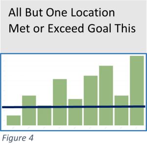 As a best practice, I recommend visuals be titled by a declarative remark stating exactly what the visual is illustrating. Figure 4 reuses our example from earlier in this article, but note the clarity the title now adds to the image from figure 3. There can be no doubt about the message, and it immediately leads to a discussion of what’s work so well so often, and why not in the one location with disappointing results. More sophisticated visuals can convey other relationships, changes over time, year over year comparisons, the driving chain influences implicit in your KP/RI’s and more.
BI Tools and Your GRC
Your GRC is an integration platform that can host data about many different risk categories, including operational, financial, third party and cyber to name a few. It’s also a place where regulatory and contractual obligations, compliance, and audit processes may be managed, remediation specified, tracked and reported. This single point repository for overall governance, risk, and compliance is a great place to house BI tools to explore the consolidated data, across these disciplines and actions, to help you identify, explore, analyze, and communicate current performance, key relationships, and potential opportunities to protect and enhance your overall performance. BI tools help you realize and maximize the value inherit within your consolidated data. Product and service performance, both current and predictive are within its grasp. Likewise, critical risks, vulnerabilities and opportunities for leveraged remediation become clear. Potential third party issues, whether supply chain related, or implicit in vulnerabilities they impose on your infrastructure become visible. And so much more.
The investment in a GRC tool is enhanced and brought to maximum value in large part through the business questions it answers, the proactive vision it affords, and the informative support it provides leadership. Your BI tools are the glasses that clarify this world and sharpen your vision of your current state, with enhanced acuity to look towards the horizon and anticipate tomorrow.
About the Author:
Simon Goldstein is an accomplished senior executive blending both technology and business expertise to formulate, impact, and achieve corporate strategies. A retired senior manager of Accenture’s IT Security and Risk Management practice, he has achieved results through the creation of customer value, business growth, and collaboration. An experienced change agent with primary experience in financial, technology, and retail industries, he’s led efforts to achieve ISO2700x certification and HIPAA compliance, as well as held credentials of CRISC, CISM, CISA.
—
Some observations from DoubleCheck Software on Business Intelligence tools :
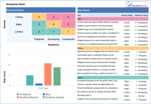
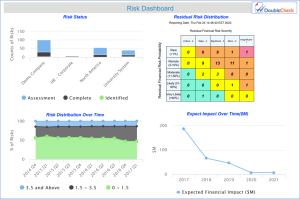
It is critical to have flexibility and simple tools for extracting BI data from your GRC system into comprehensive, visually informative documents and slideware. Reports 1 & 2 below demonstrate different ways to render information to Management, Board of Directors, and team members. Report 1 (Risk Dashboard) provides a snapshot of the entire Risk Register, including overall Risk Status, Risk Distribution via a Heat Map with drillable values, Risk Distribution over Time, and monetary Risk Impact over Time. Report 2 (Enterprise Risks) goes deeper and provides more specific Risk Details.
Report 1
Report 2